In honor of Women’s History Month, we’re recognizing some of the great female artists and designers who have contributed to the stamp creation process. This is the second in an occasional series of interviews.
 In the ten years since she graduated with a Bachelor of Fine Arts degree from Washington University in St. Louis, graphic designer Suzanne Kleinwaks has come a long way. Last year, she opened her own design firm, Suzanne Kleinwaks Design. Through her company, the Baltimore native has created designs for the World Food Program USA, the U.S. Department of Health and Human Services (Office on Women’s Health), and the Cancer Support Community.
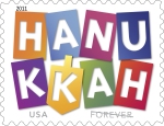
Her first project for the U.S. Postal Service, the Hanukkah Forever® stamp, was released in 2011. (Ethel Kessler was the project’s art director. Kleinwaks was the designer and typographer.) Recently, Kleinwaks caught up with me via email.
Growing up, were you interested in art?
Yes, I have always been artistically inclined. My parents were supportive of my talents and helped create opportunities for me to develop, such as art summer programs and extracurricular programs. I explored many facets of art through school and these programs—painting, photography, sculpting…I got to try out a lot of mediums. I did not explore designing on the computer, however, until I got to college.
 So how did you become interested in graphic design?
When it came to figuring what I would want to study in college, I knew I wanted to do something in the creative field. I started doing research on the communication aspects of art and design and decided to go that route. I ultimately attended Washington University in St. Louis where I got a BFA in visual communications. The more I have grown in my career, I am confident I made the best choice for myself—I love the challenge that comes with combining problem-solving and creativity.
How did you get involved with the Hanukkah stamp project?
Ethel Kessler and I had worked together, so she was very familiar with my work. When this opportunity came up, she asked if I was interested and I was thrilled!
What was your inspiration for this particular design?
I researched and explored a lot about Hanukkah and related imagery. When Ethel and I got down to deciding the focus, we decided that we wanted the stamp to reflect the joy of the holiday—hence the use of bright colors and movement. The cut-paper feel and colors mimic the movement of the dreidel—a children’s holiday game.
Was it pretty cool to mail your holiday cards and gifts with a stamp you designed?
It was awesome! I remember the first piece of mail that came in with it—I saved the envelope.
Did you enjoy working on this stamp?
I really enjoyed it. It’s fascinating to work on something that needs to communicate a big idea at such a small scale. It’s similar to logo design in that way (which I do a lot of in my business) because it needs to be able communicate your message clearly at a small size (or in the case of logos, multiple sizes and situations).
 On Friday, October 11, two more holiday stamps will be released at the ASDA stamp show. One is the , which features Gossaert’s 1531 painting Virgin and Child.
 The other is the Holy Family Forever® stamp, which features an illustration showing Joseph leading a donkey that carries Mary and Jesus, guided by a star shining in the twilight of a desert sky.
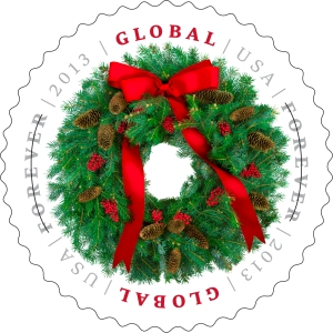
 The Global Forever®: Evergreen Wreath stamp will be released on October 24. This international rate stamp offers a single price for any First-Class Mail International® 1-ounce letter to any country in the world.
 And that’s not all. New issuances slated to be released later this fall include new Hanukkah and Kwanzaa Forever® stamps, in addition to the awesome new Gingerbread Houses Forever® stamps. Check back soon for more details!


 and the Seleucid Empire in 165 B.C. Tradition relates how a miracle took place during the rededication of the Temple in Jerusalem: The remaining supply of sacramental oil, thought to be enough for only one day, burned for eight days.
 So how did you become interested in graphic design?


